
Friday, 15 April 2011
Friday, 17 December 2010

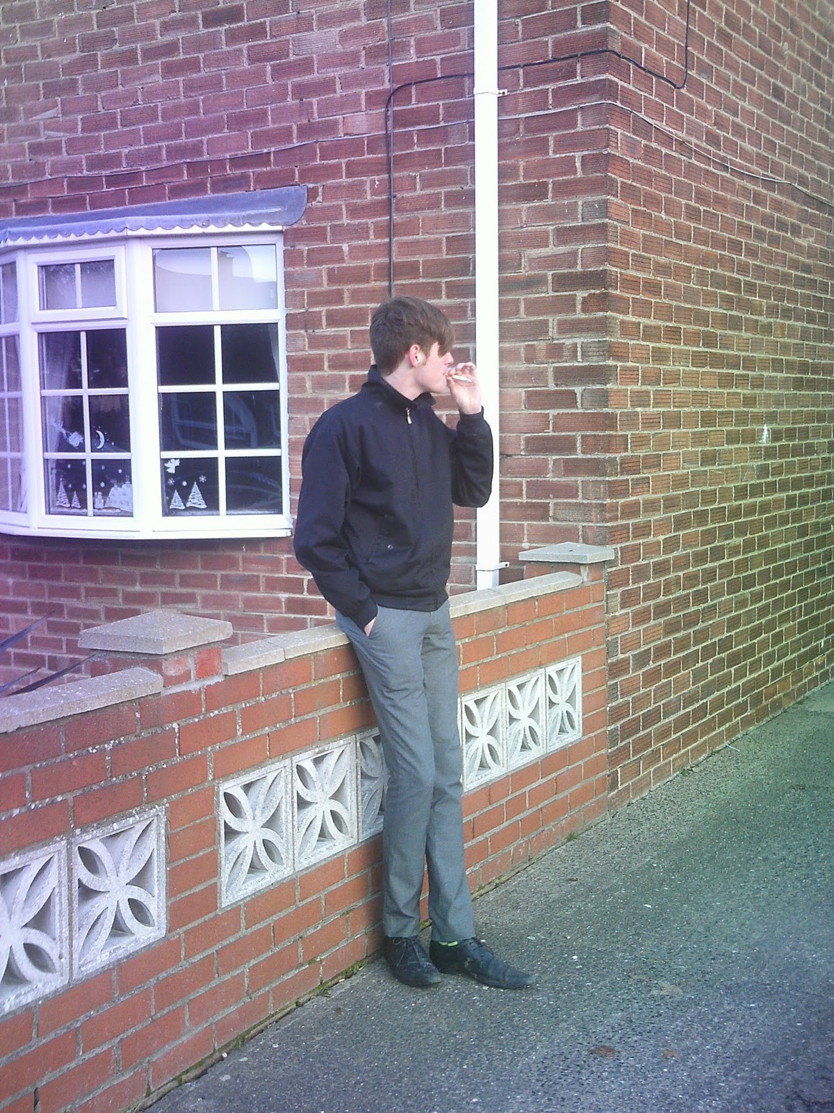
Cover Photo Ideas.

I like this image, i think it would echo my target audience and what they want.

I think again this image suits the audience, but would potentially reflect the ideology by being at a bus stop it makes it very unassuming.

I don't like this image as it is on an angle and will not make a big enough statement to be a front cover.
I think this image has a similar problem to the one prior, as the subject is looking away it will not connect with the audience or catch their eye as much.


Analysis of Mixmag Contents Page.
 In this example of Mixmag media language is conveyed in many ways. Firstly for example each of the images are dissimilar and reach out to their preferred broad audiences, the biggest image shows the fun side to Mixmag as the subject appears to be having a good time, possibly on a night out.. The two smaller images look more professional the medium close up adds a serious edge to the page and reinforces how important music is to Mixmag. The style of the font is the 70's disco font, this is completely relevant to Mixmag as they are a dance mag.
In terms of institution Mixmag was founded in 1983 and is the biggest selling dance music magazine in the world. After a few other publishers, today it is published by Development Hell. 'Among the Development Hell team are some of the most experienced and respected operators in British magazines' this is from the Development Hell website, the idea of being 'respected' and 'esperienced' is reflected in Mixmag, as it is monthly so, Development Hell are striving for quality over quantity. Mixmag's ideology is apparent after researching their publisher. I can see that their aim is to present readers with a range of dance music, although current it reaches out to all areas of dance music and presents it as a prestigious genre that is not just for a young minority.
Mixmag appears to have a varied audience, on their website it says:
Mixmag readers are the opinion formers and leaders in clubbing. They are the ones who make the happening music happen and the cool products cool within their peer group.
"They are the first to recommend a new tune and the first on a new fashion trend. They’re at that new cool club very early and they move on before it starts to go cold . They’re the best informed about top DJs and upcoming tunes, and they just have to have the latest mobile (even if their current one is less than six months old). They’re the biggest downloaders of music in the UK.
The median age of a Mixmag reader is 26 – 72% male, 28% female – and they tend to be urban and single.
They have a high disposable income and a high propensity to spend it on:
(from the mixmag website)
With representation in this magazine contents it is alol over positive because of the broad audience Mixmag claims to have, they have picked something to appeal with everyone.
Thursday, 16 December 2010
NME Contents Page Analysis.

The media language on this contents page is very simple, each week the page is the same, it has an established house style of the red and the black which is instantly associated with NME's brand image, further more this relates to how prestigious it is and adds professionalism. The yellow used in the subscription box is used cleverly to draw the readers eye, also getting the readers attention, by putting a band as well known as Oasis on the first page with entice anyone flicking in the mag, to buy it or read on.
As an institution the NME is the longest running weekly music magazine and they are published by IPC media and with their ideology on the IPC website it says : 'Every week it gives its readers the most exciting, most authoritative coverage of the very best in contemporary music, including award winning features, the latest releases, live reviews, the definitive guide to the best new bands in its Radar section, as well as a regular look back through the magazine's incredible 58 year heritage' so I can see by this that NME is all about staying current and catering for die hard music fans, this is even more apparent when we see that they have a regularly updated website and a TV and Radio channel, so their audience does not miss anything.
The NME audience are prominently male and have a median age of 23 and on the IPC website they say:
'Not surprisingly NME readers are
completely obsessed by music.
Reader research has demonstrated
that they rely on the editorial and the
ads to keep them up to date
with new music. This knowledge then
makes them the authority in music in
their peer group
With representation, I think in this NME has given its self a positive one, using a large band as their main feature and remaining a notable style, it comes across as a very trustworthy mag as it hasn't altered its main image through the years and is providing its audience with the best of the best.
The Fly Double Page Spread Analysis.

With media language, here the house style of The Fly has been continued to some extent, the font is the same as throughout and in typical Fly style the big blue letter and pull quote, are very raw and graffiti type to maintain the mag's street edge. The images are a series of medium close ups I think this gives the effect that each member of the band has their own identity.
In terms of institution The Fly is published by the MAMA Group which is part of the HMV Group, this shows that media businesses are working in synergy as when albums appear in fly they will be bought in HMV. Also the MAMA Group owns the Barfly chain of gig venues which could also involve synergy as if The Fly says a band are worth seeing, the readers will go to see them at a venue. It relies heavily on adverts, as its a free press. Their ideology appears to be completely about music and the indie genre, they are all about finding and introducing the latest bands, for example they were the first magazine to publish Coldplay and Razorlight on the cover.
With audience The Fly taps in to a niche audience, the mag is specific for indie gig goers, this is apparent as it is mostly available at live shows. I think MAMA Group have found this gap in the market as the audience will mostly be young and possibly students so not of a high income and will be in group E. Furthermore, being out at gigs it's readily available to the target audience and I think in this example by the style of the subjects it is clear that the audience are going to be young indie students . The adverts also reflect the readership as they are mostly for alcohol, live events and modern technology.
I think as representation goes, with The Fly in this case, it is a positive one. The band have not been pigeon holed in to the usual stereotypes, but made to appear well established and iconic.

Subscribe to:
Posts (Atom)