
Friday, 17 December 2010
Cover Photo Ideas.

I like this image, i think it would echo my target audience and what they want.

I think again this image suits the audience, but would potentially reflect the ideology by being at a bus stop it makes it very unassuming.

I don't like this image as it is on an angle and will not make a big enough statement to be a front cover.
I think this image has a similar problem to the one prior, as the subject is looking away it will not connect with the audience or catch their eye as much.


Analysis of Mixmag Contents Page.
 In this example of Mixmag media language is conveyed in many ways. Firstly for example each of the images are dissimilar and reach out to their preferred broad audiences, the biggest image shows the fun side to Mixmag as the subject appears to be having a good time, possibly on a night out.. The two smaller images look more professional the medium close up adds a serious edge to the page and reinforces how important music is to Mixmag. The style of the font is the 70's disco font, this is completely relevant to Mixmag as they are a dance mag.
In terms of institution Mixmag was founded in 1983 and is the biggest selling dance music magazine in the world. After a few other publishers, today it is published by Development Hell. 'Among the Development Hell team are some of the most experienced and respected operators in British magazines' this is from the Development Hell website, the idea of being 'respected' and 'esperienced' is reflected in Mixmag, as it is monthly so, Development Hell are striving for quality over quantity. Mixmag's ideology is apparent after researching their publisher. I can see that their aim is to present readers with a range of dance music, although current it reaches out to all areas of dance music and presents it as a prestigious genre that is not just for a young minority.
Mixmag appears to have a varied audience, on their website it says:
Mixmag readers are the opinion formers and leaders in clubbing. They are the ones who make the happening music happen and the cool products cool within their peer group.
"They are the first to recommend a new tune and the first on a new fashion trend. They’re at that new cool club very early and they move on before it starts to go cold . They’re the best informed about top DJs and upcoming tunes, and they just have to have the latest mobile (even if their current one is less than six months old). They’re the biggest downloaders of music in the UK.
The median age of a Mixmag reader is 26 – 72% male, 28% female – and they tend to be urban and single.
They have a high disposable income and a high propensity to spend it on:
(from the mixmag website)
With representation in this magazine contents it is alol over positive because of the broad audience Mixmag claims to have, they have picked something to appeal with everyone.
Thursday, 16 December 2010
NME Contents Page Analysis.

The media language on this contents page is very simple, each week the page is the same, it has an established house style of the red and the black which is instantly associated with NME's brand image, further more this relates to how prestigious it is and adds professionalism. The yellow used in the subscription box is used cleverly to draw the readers eye, also getting the readers attention, by putting a band as well known as Oasis on the first page with entice anyone flicking in the mag, to buy it or read on.
As an institution the NME is the longest running weekly music magazine and they are published by IPC media and with their ideology on the IPC website it says : 'Every week it gives its readers the most exciting, most authoritative coverage of the very best in contemporary music, including award winning features, the latest releases, live reviews, the definitive guide to the best new bands in its Radar section, as well as a regular look back through the magazine's incredible 58 year heritage' so I can see by this that NME is all about staying current and catering for die hard music fans, this is even more apparent when we see that they have a regularly updated website and a TV and Radio channel, so their audience does not miss anything.
The NME audience are prominently male and have a median age of 23 and on the IPC website they say:
'Not surprisingly NME readers are
completely obsessed by music.
Reader research has demonstrated
that they rely on the editorial and the
ads to keep them up to date
with new music. This knowledge then
makes them the authority in music in
their peer group
With representation, I think in this NME has given its self a positive one, using a large band as their main feature and remaining a notable style, it comes across as a very trustworthy mag as it hasn't altered its main image through the years and is providing its audience with the best of the best.
The Fly Double Page Spread Analysis.

With media language, here the house style of The Fly has been continued to some extent, the font is the same as throughout and in typical Fly style the big blue letter and pull quote, are very raw and graffiti type to maintain the mag's street edge. The images are a series of medium close ups I think this gives the effect that each member of the band has their own identity.
In terms of institution The Fly is published by the MAMA Group which is part of the HMV Group, this shows that media businesses are working in synergy as when albums appear in fly they will be bought in HMV. Also the MAMA Group owns the Barfly chain of gig venues which could also involve synergy as if The Fly says a band are worth seeing, the readers will go to see them at a venue. It relies heavily on adverts, as its a free press. Their ideology appears to be completely about music and the indie genre, they are all about finding and introducing the latest bands, for example they were the first magazine to publish Coldplay and Razorlight on the cover.
With audience The Fly taps in to a niche audience, the mag is specific for indie gig goers, this is apparent as it is mostly available at live shows. I think MAMA Group have found this gap in the market as the audience will mostly be young and possibly students so not of a high income and will be in group E. Furthermore, being out at gigs it's readily available to the target audience and I think in this example by the style of the subjects it is clear that the audience are going to be young indie students . The adverts also reflect the readership as they are mostly for alcohol, live events and modern technology.
I think as representation goes, with The Fly in this case, it is a positive one. The band have not been pigeon holed in to the usual stereotypes, but made to appear well established and iconic.

Mixmag Double Page Spread Analysis.

In terms of media language, this is to be taken with a grain of salt, the image links to the narrative of the article which is commenting on celebrity dj's and weather it is their ability or status that is getting them the gigs. We can see by the costume of the subject and the paparazzi cameras that it is latching on to a stereotype in order to mock the celebrity culture for example the short dress, fake tan, blonde hair and prop of the small dog reflects the tabloid culture and this leads to the fact the article isn't a positive one. The low camera angle takes the idea of celebrity even further, by using the camera underneath the subjects eye line makes the them look more powerful. The heading 'Welcome to Lame Acadamy' extends the mockery further and the colour used, as yellow has connotations of cowardice and could show the subject as being talentless. Even though a lot of meaning is meant through the layout, it still sticks to the Mixmag house style of bright colours also the font in the article is the same all the others in the mag.
In terms of institution Mixmag was founded in 1983 and is the biggest selling dance music magazine in the world. After a few other publishers, today it is published by Development Hell. 'Among the Development Hell team are some of the most experienced and respected operators in British magazines' this is from the Development Hell website, the idea of being 'respected' and 'esperienced' is reflected in Mixmag, as it is monthly so, Development Hell are striving for quality over quantity. Mixmag's ideology is apparent after researching their publisher. I can see that their aim is to present readers with a range of dance music, although current it reaches out to all areas of dance music and presents it as a prestigious genre that is not just for a young minority.
Mixmag appears to have a varied audience, on their website it says:
Mixmag readers are the opinion formers and leaders in clubbing. They are the ones who make the happening music happen and the cool products cool within their peer group.
"They are the first to recommend a new tune and the first on a new fashion trend. They’re at that new cool club very early and they move on before it starts to go cold . They’re the best informed about top DJs and upcoming tunes, and they just have to have the latest mobile (even if their current one is less than six months old). They’re the biggest downloaders of music in the UK.
The median age of a Mixmag reader is 26 – 72% male, 28% female – and they tend to be urban and single.
They have a high disposable income and a high propensity to spend it on:
(from the mixmag website)
Friday, 10 December 2010
NME Double Page spread analysis.

In terms of media language, this double page spread presents with a very youthful image because of the images that have been placed on the wall and the costume, linking with the fact the band are named the teenagers, this is also seen in the pull quote the editor has chosen to highlight 'Of course we are sexual. We're The Teenagers and that's all we think of' this is echoed in the setting in which the posters in the background are used, i think this is because it echoes the bands representation and the age of the audience that will be listening to them. The camera angle is usually used to belittle the subject however I think in this case it seems to fight this convention as the pose of the subjects seems care-free and somewhat rebellious but still the angle could be a statement of their place in society and reflect the media opinion of The Teenagers. The layout the image takes over more of the spread this is more than likely as it needs to appeal to people that maybe do not want to read a large amount of text. Also a house style is made evident with blue and the repeated font, the blue does have connotations of the male gender which is obviously prominent in this article. The puff which says 'nme loves' appears hand written,, this is very street and as it it where just added echoing NME's fast press and music news.
As an institution the NME is the longest running weekly music magazine and they are published by IPC media and with their ideology on the IPC website it says : 'Every week it gives its readers the most exciting, most authoritative coverage of the very best in contemporary music, including award winning features, the latest releases, live reviews, the definitive guide to the best new bands in its Radar section, as well as a regular look back through the magazine's incredible 58 year heritage' so I can see by this that NME is all about staying current and catering for die hard music fans, this is even more aparent when we see that they have a regularly updated website and a TV and Radio channel, so their audience does not miss anything.
The NME audience are prominently male and have a median age of 23 and on the IPC website thay say:
'Not surprisingly NME readers are
completely obsessed by music.
Reader research has demonstrated
that they rely on the editorial and the
ads to keep them up to date
with new music. This knowledge then
makes them the authority in music in
their peer group'
I think the reader profle is very recognisable in the double page spread i have choosen, we can see for the house style and choosen image they have channeled in to their indie music loving niche audience that is mostly male.
For the young readers of NME this double page, this would be a positive representaion, this is because the band look cool and rebelious. Also the puff 'NME loves' and the headline 'Everybody's talking about' represents how NME is the place to be and how presigous it is that people do actually care about their opinions.
Wednesday, 24 November 2010
The Fly Cover Analysis
 With regard to media language The Fly has a simple layout, for example their masthead is simple, i think this adds an unassuming nature to the brand image, it's just about the music not a gimmick, this is reflected in the fact the magazine is free and the puff to tell us this is very evident. The actual title also as 'The Fly' connotates the fly-on-the-wall idea and how they find new bands and artists before anyone else. Also the picture is a mid shot of the band Warpaint, it has hints of attitude made more apparent by the anchorage of the headline by saying 'psych-rock sirens' we know this is an eccentric band. Furthermore the second puff is done in graffiti style to co inside with the house style which is also used on the main headline, the shows rebellion.
In terms of institution The Fly is published by the MAMA Group which is part of the HMV Group, this shows that media businesses are working in synergy as when albums appear in fly they will be bought in HMV. Also the MAMA Group owns the Barfly chain of gig venues which could also involve synergy as if The Fly says a band are worth seeing, the readers will go to see them at a venue. It relies heavily on adverts, as its a free press. Their ideology appears to be completely about music and the indie genre, they are all about finding and introducing the latest bands, for example they were the first magazine to publish Coldplay and Razorlight on the cover.
With audience The Fly taps in to a niche audience, the mag is specific for indie gig goers, this is apparent as it is mostly available at live shows. I think MAMA Group have found this gap in the market as the audience will mostly be young and possibly students so not of a high income and will be in group E. Furthermore, being out at gigs is readily available to the target audience. The adverts also reflect the readership as they are mostly for alcohol, live events and modern technology.
Representation on the cover, for example the title 'warpaint' is presented as very edgy, it is not dissimilar to the Sex Pistols logo, it shows the band as edgy and punk and the image of the band appears like on newsprint, as if it is new, the band are hot off the press. Also the connotations of the title The Fly represents a fly on the wall, they find bands no one else has seen of heard of.
Thursday, 18 November 2010
Analysis of Mixmag Cover
 In terms of media language this issue of Mixmag is a good example. The chosen house style is bright and attention grabbing reflecting the new acts that the magazine is introducing. You can recognise it as a dance/DJ magazine as it is much more light hearted and fun than other genres as it is linked with the dance and club scene also the styling of the people in the main image reflects this as well. The mag speaks to the audience by the cover image, the artists are recognisable within the genre, the shot used is low angle making the audience see them as something to aspire to be. The sell lines present us with an inviting narrative, for example 'NYC'S CLUBBING REVIVAL' has appeal because the magazine is based in Britain, the audience is given and almost exclusive insight in to such an iconic place as New York. Also we have the conventional banner at the top of the cover, this advertises a free CD, its puff and works in synergy with the artist 'WARHOUSE PROJECT' as it will increase sales of the magazine but at the same time promote the artist, however this has emphasis on the importance of genre, Mixmag has a niche audience, therefore the advert would be irrelevant for someone who couldn't identify with this genre of music.
In terms of institution Mixmag was founded in 1983 and is the biggest selling dance music magazine in the world. After a few other publishers, today it is published by Development Hell. 'Among the Development Hell team are some of the most experienced and respected operators in British magazines' this is from the Development Hell website, the idea of being 'respected' and 'esperienced' is reflected in Mixmag, as it is monthly so, Development Hell are striving for quality over quantity. Mixmag's ideology is apparent after researching their publisher. I can see that their aim is to present readers with a range of dance music, although current it reaches out to all areas of dance music and presents it as a prestigious genre that is not just for a young minority, this is echoed in the cover as the straplines contain written codes, for example 'clubbing revival' is aimed at an older audience, whereas 'underage club nights' is evidently for youngsters.
Mixmag appears to have a varied audience, on their website it says:
Mixmag readers are the opinion formers and leaders in clubbing. They are the ones who make the happening music happen and the cool products cool within their peer group.
"They are the first to recommend a new tune and the first on a new fashion trend. They’re at that new cool club very early and they move on before it starts to go cold . They’re the best informed about top DJs and upcoming tunes, and they just have to have the latest mobile (even if their current one is less than six months old). They’re the biggest downloaders of music in the UK.
The median age of a Mixmag reader is 26 – 72% male, 28% female – and they tend to be urban and single.
They have a high disposable income and a high propensity to spend it on:
(from the mixmag website)
As far as representation goes, Mixmag wants their music genre (dance) to appear fun, it is a positive representation however, I think the brand image uses a niche audience to its advantage by alienating readers who don't particularly follow the genre exclusively.
Wednesday, 10 November 2010
Convetions of a Music Magazine Cover

All magazines use a masthead, on this particular magazine we can see the masthead of the NME, placed in the top left allowing to always be seen and recognised whilst stacked in shops. The red of the masthead is repeated and creates a house style that is only associated with the NME. Red has connotations with ignorance and anger, this ties in with the magazines ideology by aiming to be alternative and pushing against popular music, it also demonstrates their passion for music.
The NME also includes a banner which is vital to all music magazines. Placed at the top it is the first thing the reader sees and NME have taken this further by using such a prestigious band as Oasis to add to the impact of the banner.
Another example of a convention is the main features headline, in this case it is entitled 'CRYSTAL CASTLES', the font and colour is consistent to the house style. The teaser below the main headline- 'murder drugs and twisted love' coincides with its alternative views, for example: the words 'murder' and 'twisted' could not be seen on the cover of Smash Hits.
It is intrinsic for a magazine to have the price labeled on the magazine. The NME is priced at £2.30, this instantly tells us the magazine is meant for younger people, in comparison with a magazine such as Q which is priced at £5 it is cheap and therefore within a younger persons disposable income.
The image on this issue of NME, the chosen image is very dark and links to the sell lines, the words 'twisted love' is echoed in the stance of the band, the two appear awkward but we can see through styling and how close they are that there is a relationship there. Also with styling, the readers of NME are reflected, the leather and make up has connotations of the rock/indie genre. We can see it is alternative as Alice Glass is smoking, a mainstream magazine would not include this as smoking is frowned upon, furthermore this could represent the band as alternative or moreover, could be socially unacceptable.
The representation of the band in the main, for the readers of NME would probably be positive, the angle is low making them seem important and maybe something readers would aspire to be.
Wednesday, 3 November 2010
LIIAR Interpretation of the Main Task
LANGUAGE- This will include my chosen camera angle, position and distance, I will determine these by looking into the codes and conventions of existing music magazines. Also with language I will have to create a house style to be seen through my layout and things such as my finished splash, to be effective it will have to be consistent.
INSTITUTION- The institution are the producing companies of the magazines, for example NME, is published by IPC, the magazine will work in synergy to achieve the desired profit, There is a market for each magazine that is published, therefore each publisher will make a variety magazine as to not eat into their own audiences.
IDEOLOGY- All magazines have their own set of values, morals and a message they want to convey. This can be seen in many ways for example the connotation of the magazine name NME stands for New Musical Express, showing a fast print rate and an urgency to provide their audience with the information.
AUDIENCE- A magazine will always have a target audience, this is determined by age, gender and social class :
A-Upper Middle Class
B- Middle Class
C1- Lower Middle Class
C2- Skilled Working Class
D- Working Class
E- Under Class
B- Middle Class
C1- Lower Middle Class
C2- Skilled Working Class
D- Working Class
E- Under Class
REPRESENTATION- For example, a front cover image will represent the audience. Often with most magazines including music magazines the subject of an image is presented in aspirational terms, representing what the reader wished to be.
Main Task Brief
The front page, contents page and double page spread of a new music magazine. All images must be origanal, produced by you - minimum of 4 images.
Friday, 22 October 2010
Evaluation

My institution of a college magazine was given a bit of an edge by being more based on events and the fun sides to college like. The ideology of it is getting the balance of work and play, which i feel would really reach to all students.
In terms of audience I wanted the magazine to steer away from the convention of being for both teachers and pupils, but for it to be entirely for students from 16-19. I think this was a good choice however in the real world if this was published i would have to consider things for teachers as to broaden the market.
Through my cover i have tried to represent my ideology, mainly by using my picture, the brightness, models expression and prop, show us an idyllic student, this sort of show readers this is what they could get from reading this magazine. Also through my colour scheme we can see it sets + represents the relaxed tone I wish would be through a full issue of the mag.
In conclusion, I would say it has gone quite well, my only major problem was that couldn't use the font I want as it couldn't be downloaded to the college computer and also in the future I would manage my time better.

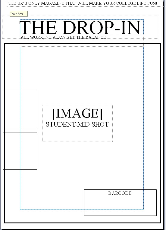


Contents Page

This is a brief idea of what i want my contents page to look like, the colours match my front cover.
Examples and Analysis of Photos

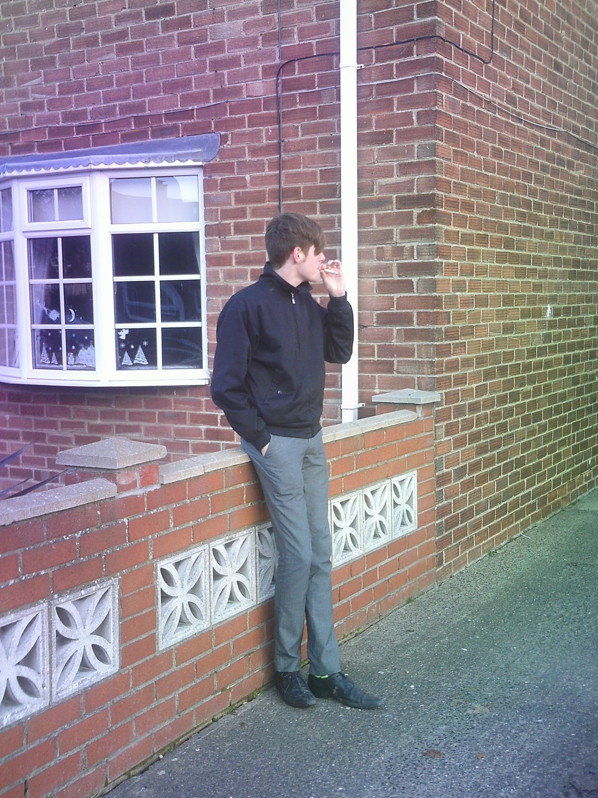
This was my first attempt at shooting the cover shot. For this photo I involved the books and a model dressed casually so that the photo represented my institutions ideology. The pose worked well, but as we were photographing in an area with limited light I didn't really get the inviting look i wanted to go for.


Finally, I used the pose from the darker photo in the light, this is my favourite shot as I think it really represents the look I am going for. I think it would reach my target audience as something that they would like to read.
Masthead Ideas

These are a few examples of mastheads that I could use, I feel that the third one in seems the most appropriate for my magazine, this is due to the fact it looks readable, which fits in with my ideology of getting the right balance of work and play. Looing at my title I have decided it is to long and if I were to call it THE DROP IN, it is more catchy and memorable.
Wednesday, 20 October 2010
Analysis of a College Magazine 2

In terms of media language this magazine, like the other has used a mid shot but this is more to convey a work ethic and shows the audience they are aiming toward. Also the college hasn't got a strap line or slogan like the other to highlight the ideology, however, the teaser on the magazine say 'science' in a large font which again reaches to the target audience. In the shot of the photo, they have extended this by involving tools and equipment relevant to the courses the college is selling.
In terms of institution we can see that it is the Beloit college, as they have chosen this to be their masthead, furthermore by the chosen colour of the masthead and text it is portrayed to be simple and to the point as it is white, this is shown even more in the bland colours of the image. The ideology seems to be that education is the main and that the model used looks very interested, it shows us they believe that students should be enthused by their subjects.
For audience it is aimed at science students, more so ones who already know that is what they want to do as there is nothing on the front cover to draw other in.
Students are represented on this cover by the image, the looks concentrated and involved, yet males are not represented on this cover, this works against the conventions and old ways of men working in science. In doing this they have involved women and presented themselves as a modern college.
Tuesday, 19 October 2010
Aanalysis of a College magazine

In terms of media language we can see from this example that they have chosen to use a mid shot presenting a comfortable, easy going boy, this shows an aspect of college that is less conventional yet still using the prop of books to still relate with an educating ideology. The strap line for the magazine is 'Your guide to everything hip, hot and happening' this is completely personal to the reader and invites the college students to be involved in something that appears they cannot miss. Also this is seen through the sell lines down the side, it all appeals to the modern college student with mentions of things such as 'Blackberry' and talks of night life.
The institution is College Lifestyle Magazine, we can see through the style and contents of the magazine we can see that the magazine wants to portray a more relaxed approach to their ideology, we can see that they believe in the enjoyment of students time at college.
In terms of audience it is aimed at the young student, the masthead is covered re-enforcing the importance of the attractive, cool male model that will be desired and looked up to attracting people to choose this magazines over more serious ones.
Lastly the magazine is represented it many ways the image, firstly show the model giving up eye contact and invites the reader in this also relates to the bright eye catching text giving the magazine an edge.
Friday, 8 October 2010
LIIAR
L - LANGUAGE
In making my College magazine I will need to use meadia terms and language, for example I will have to have a style that involes font colour and graphics. Also the media language will be seen in the picture I use which will be a medium close up.
I - INSTITUTION
The institution is the producing company of my magazine, this will have a set shared beliefs that will be convayed through the style and connotations of what i have made.
I - IDEOLOGY
The ideology the the set of ideas and for the College magazine this will be the idea of education or maybe something a bit more alternative to appeal to college students.
A - AUDIENCE
The audience is the people that will eventually comsume the media, for the College magazine this could be students, parents or teachers.
R - REPRESENTAION
The representaion is how the ideas are represnted. This can be in many ways and works with connotations to share the beliefs and thoughts, it can be done through what the text says, the pictures and the all over style.
Wednesday, 6 October 2010
The Brief
Using DTP and an image manipulation program, produce the front page of a new school/college magazine, featuring a photograph of a student in medium close-up plus some appropriately laid out text and a masthead. Additionally you must produce a mock up of the layout of the contents page.
Subscribe to:
Comments (Atom)